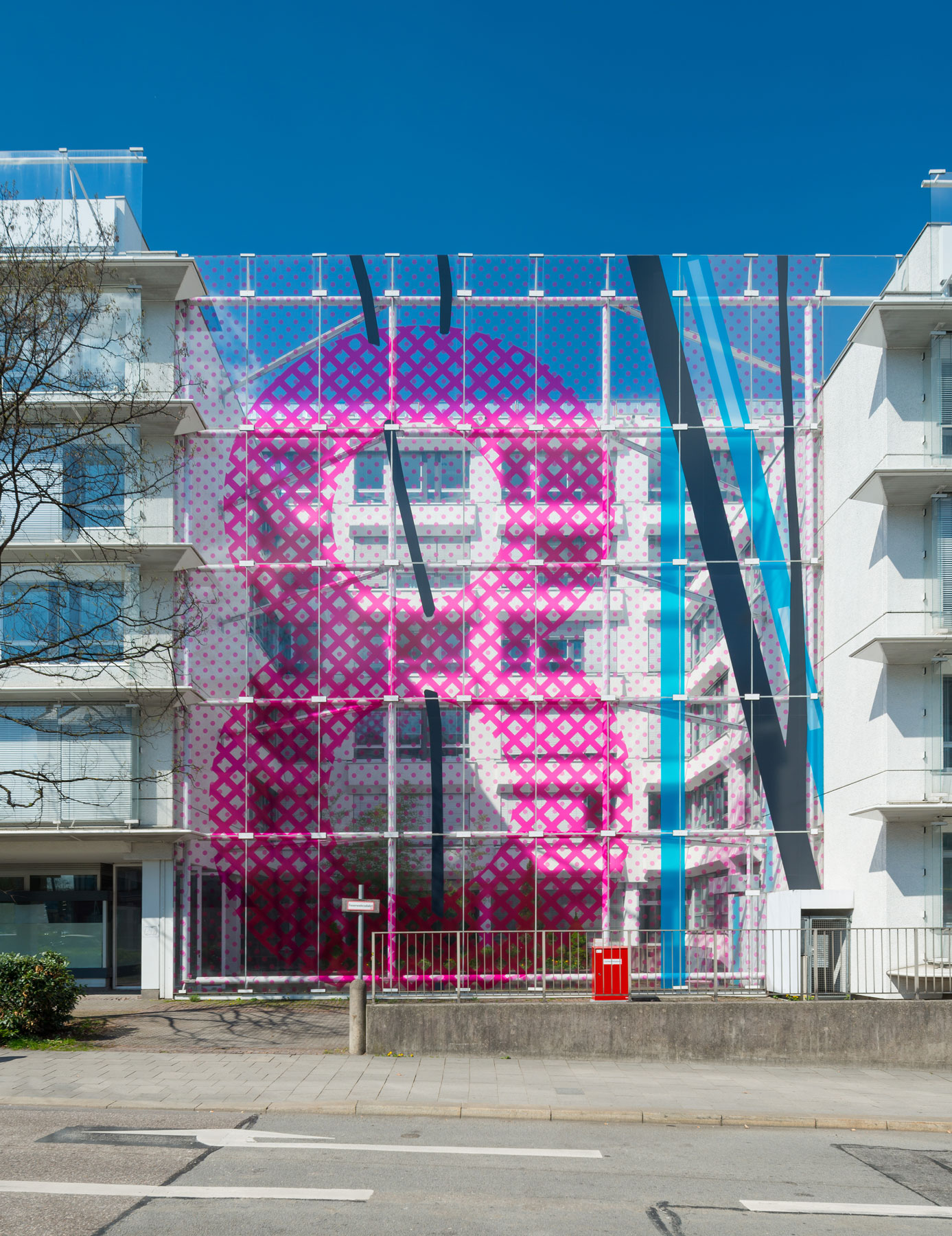
The Proiect: Leuchtenbergring, Berg am Laim, Dingolfinger Strasse
The artist Frank Wurzer has for the past few decades been casting his artist ’92s eye on city maps, those indispensable aids for people seeking orientation when moving in unknown quarters. The letters and numbers (coordinates) help the map reader find his exact location and his destination.
When Frank Wurzer looks at a map, his interest is not primarily drawn to the large and the whole, but rather towards select details. The image sections bear not only the name of the city in question, but also the coordinates of the grid square, such as New York J 2, Madrid E 5, Paris Q 16. This progression of works constitutes an artistic series.
The different sections are fundamentally quotes taken from existing maps. Wurzer then employs classical scale shifts to enlarge his subject. The revealed templates are reworked and in part reinvented.
Through his selection and fixing of these specific cut-outs, Wurzer lets ostensibly unimportant and overlookable locations on the city map emerge into large-scale, focused highlights. The trivial attains prominence and is given a new attention.
The pop-art flavor here suggests another commanding and vital aspect. The exponents of pop art were namely motivated first and foremost by a desire to illuminate the everyday and its triviality. The handmade and silkscreen printed map sections also make formal reference to (oder: cast also a formal light on) certain features of pop art. Wurzer’s large-scale pictures are often produced in an elaborate 6-color silkscreen process. The result is abstract color field painting that counteracts a planned approach and allows a broadened range of associations.
The enlarged sections are crossed by matrix points. The colored and planar fields are edged by color outlines. The palette holds above all intensive and primary colors. Points, lines and lettering are the basic elements of these images. We are talking here of painting. Color and form put on a bold show.
The three spaces where the Art works will be mounted are pointing in three different geographical directions And the motifs of these art works, i.e. city maps, refer to the topics of city planning, and urbanity.
The mounting spaces for those Art works will deliberatelynot be concealed by the works. With help of transparentsheets the city map details will be fitted onto the glass facade, in quite the right scale.
This transparency affords us a symbiosis between external and interior space. There’s openness for the viewer both inwards and outwards. Seen from the streets – by looking through the art works – the urbanity is on view inside the building, too.
This way, our site is provided by the artist with a subtle, unique facade. The whole Object Leuchtenbergring, Berg am Laim and Dingolfinger Strasse will present a unique recognition value, in interplay with the Arts in Greater Munich.